ShopDreamUp AI ArtDreamUp
Deviation Actions


Description
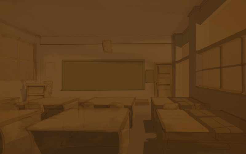
this is the monochrome version...
you could see the shadow more clearly in here
use the brown color to give the atmosphere...
here is the color on [link]
hope you like it
you could see the shadow more clearly in here
use the brown color to give the atmosphere...
here is the color on [link]
hope you like it
Image size
800x500px 134.54 KB
© 2009 - 2024 Clockheart
Comments4
Join the community to add your comment. Already a deviant? Log In
Yap i agree...a little too dark dude!!
u could give lighting coming from the windows...n
the perspective was GREAT!!

u could give lighting coming from the windows...n
the perspective was GREAT!!